How hawkers focus on 
making great cuisine
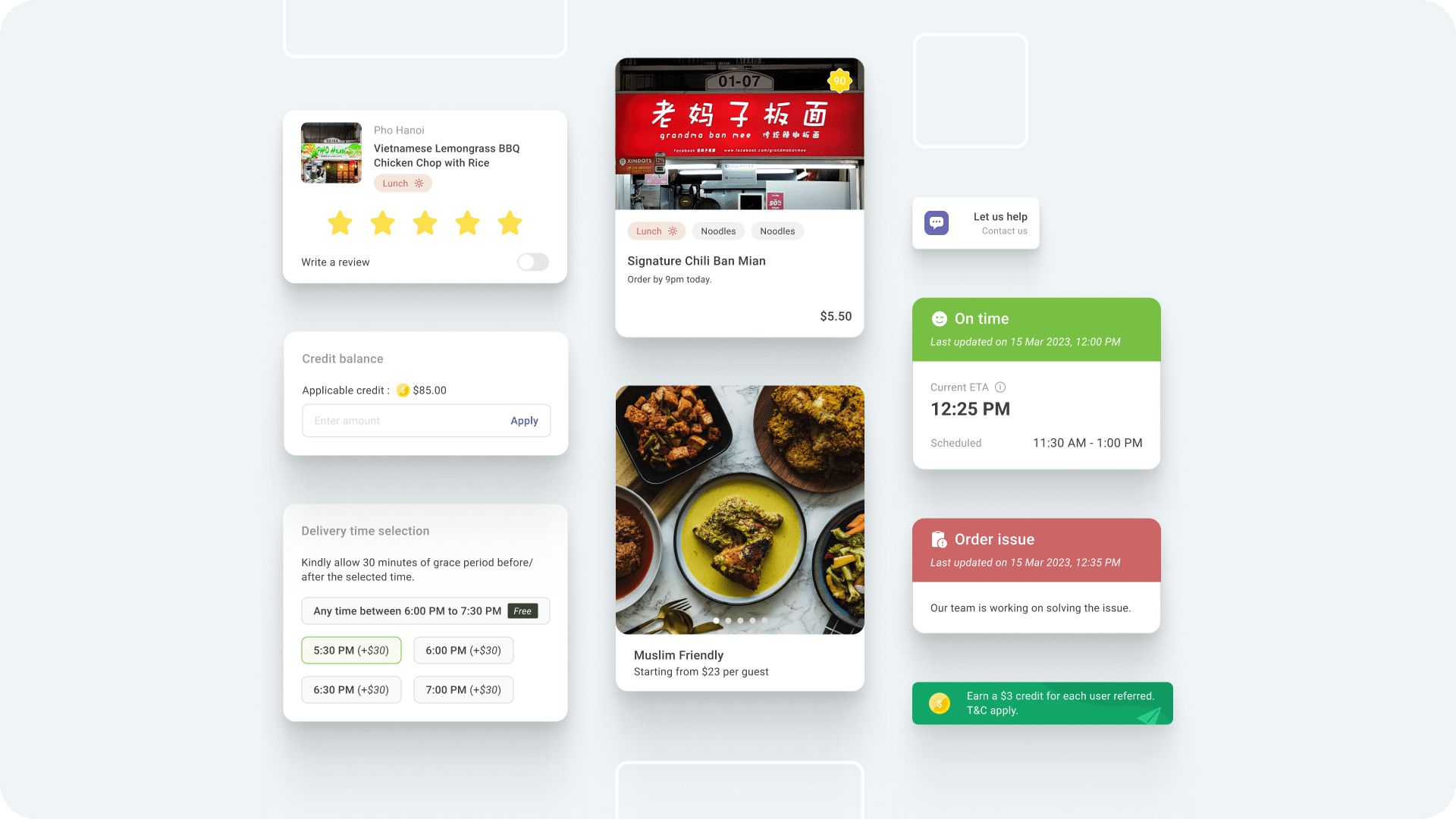
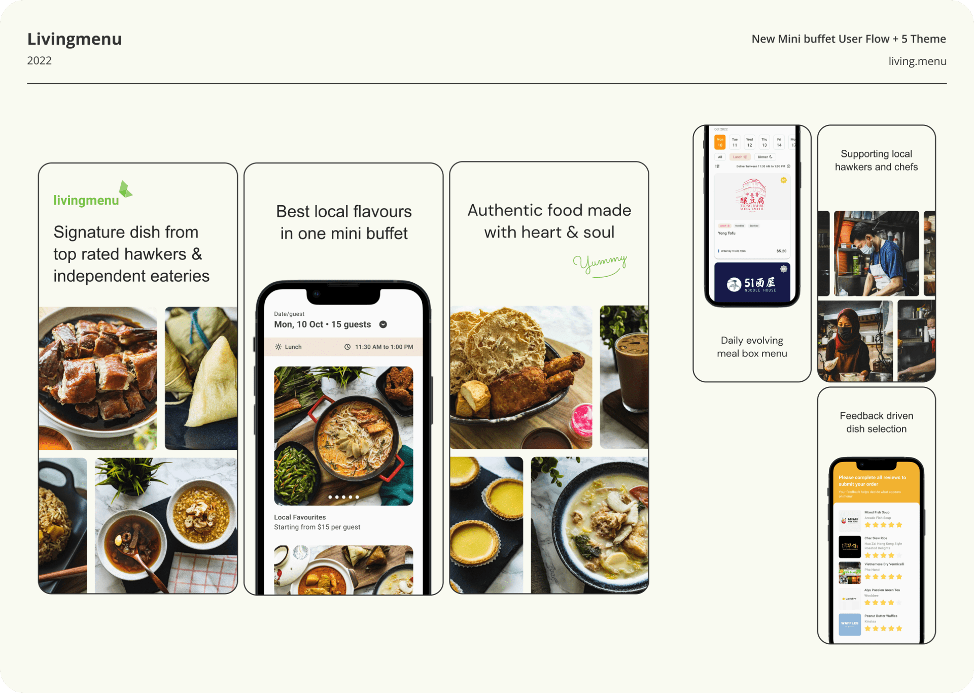
BRANDING / BUSINESS / CASE STUDY / UIUX

Livingmenu 3.0 component​​​​​​​s

My Role
Product Designer


About The Team
1 Product Designer, 2 Software Engineers
Year
May 2020 - Present


My Contribution
User Research, Service Design, Prototyping, User Testing, User Interface Design

About LM
Livingmenu is a Singapore-based food tech innovator that empowers greater efficiencies in hawkers, food stalls and independent eateries to improve the sustainability of Asia's local food culture.

Our vision is to create a world where people can eat well affordably, conveniently and make a positive social impact all together. We are building the future food service solution with you, one step at a time.
Am I eating the best local food?
Project brief & favourite questions for myself, CEO and foodies

​​​​​​​

The Problem
If you think of local food in Singapore, the must-try iconic dishes would be chicken rice, wonton mee, nasi lemak, carrot cake, laksa and many more. However, to even know which local food is best to fill your craving, it takes time and effort to find and try it out.

Furthermore, some of the best local food stalls are poorly accessible—hard to navigate, with long queues and varying hours of operation.
Groundwork
Based on the National Heritage Board, there are more than 110 hawker centres spread across Singapore's island. By 2027, an additional 13 hawker centers will be built.

"Hawker centres reflect the culinary soul of Singapore, where everyone regardless of race and social background meets for their daily meals. I spent my childhood eating at hawker centres and hope that my children will have the same culinary experience that I did."  --- Auntie Mandy, a regular patron at Bukit Panjang hawker centres

In short, when it comes to local food Singapore has so much more to offer.

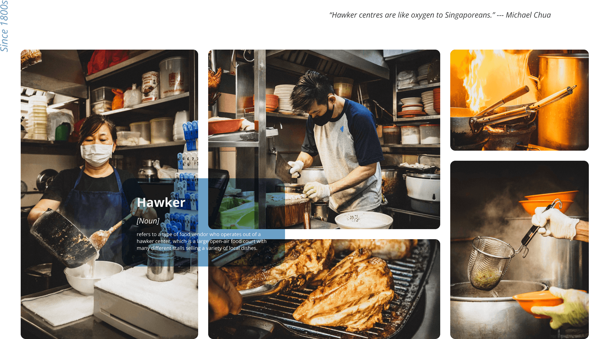
Hawker food photographed by me. The team went around Singapore to survey for the best local food. ​​​​​​​
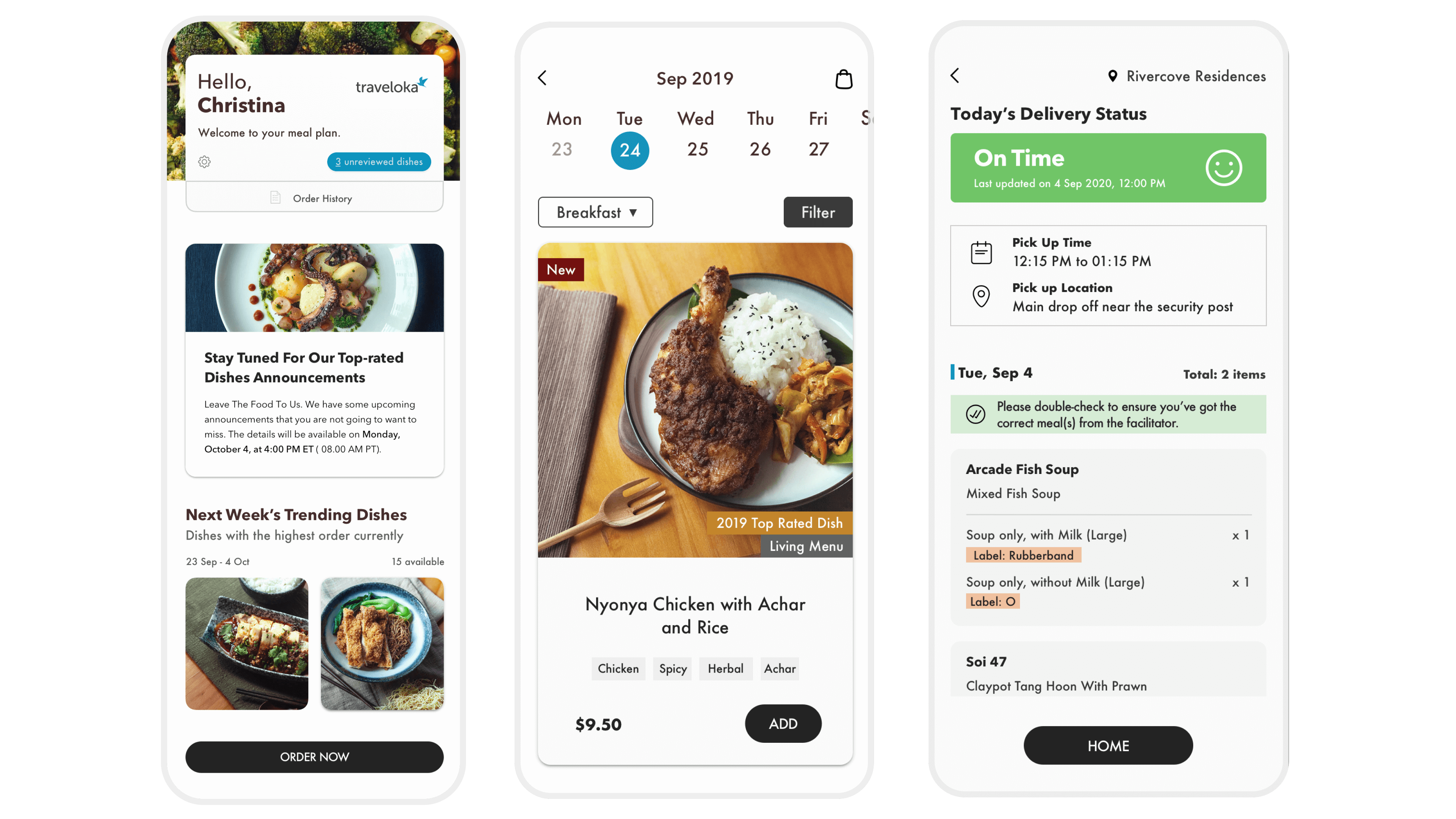
The Solution
On 1st September 2020, we soft launched an MVP livingmenu on iOS and Android, a mobile app that allows customers to order mealbox from selectively featured hawker vendors with no markup, no minimum order and no hidden cost. These are the 3 most important features of the app. Each project has design sprints from time to time to improve.

MVP features

Response
On 2nd August 2022, we introduced mini buffet.

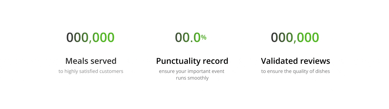
As of March 2023, we achieved

Meals served to highly satisfied customers > 329k
Punctuality record > 99%
Validated dish reviews > 210k

App Download & Website

Feature Effectiveness
There were many features we wished to build on the first MVP but some will need more time and effort while others will provide a higher return on investment in terms of customer satisfaction - loyalty, support pillar, sales revenue, boost brand reputation and reduce marketing expenses. To gain an overview and focus on the most important features, I arrange them on an Impact versus Effort matrix.

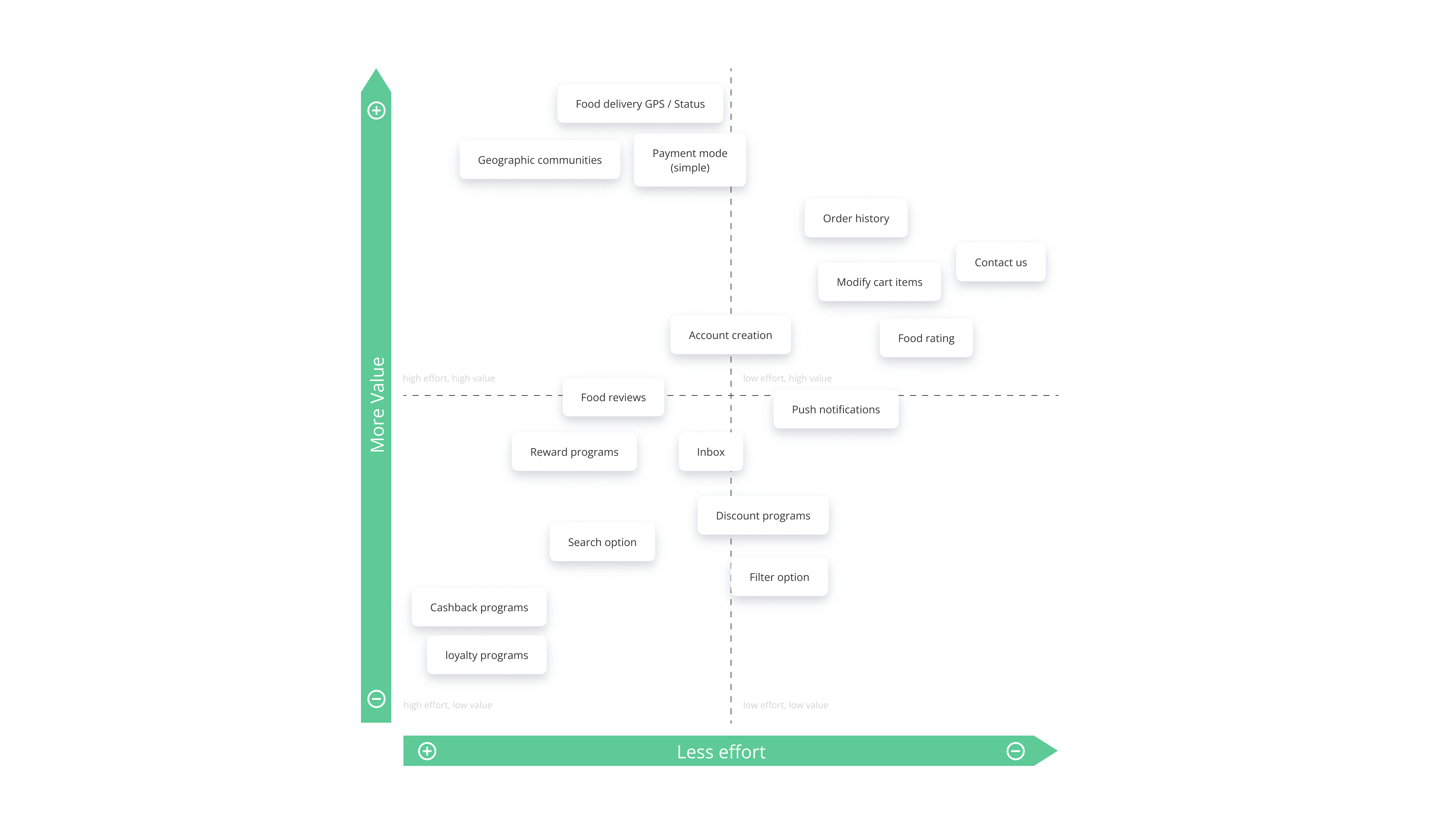
Effort - the amount of labor and resources / Impact - the value the item will bring to the end user.

Key Product Decisions 🎯
Some crucial aspects of product decisions require careful consideration and analysis of various factors such as consumer behavior, competition, production costs, and marketing strategies.

• Guest account for new users
We wanted to increase accessibility by first providing guest accounts. It allows users who do not want to create a full account to access and explore the app's features and content. Additionally, increasing the rate at which users convert to creating a full account after gaining access to what they want. Account creation will be made only when they decide to place orders for any of the dishes.

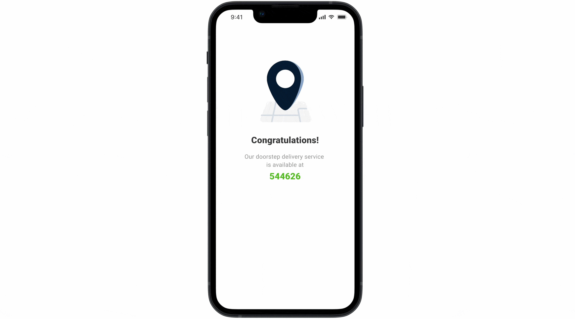
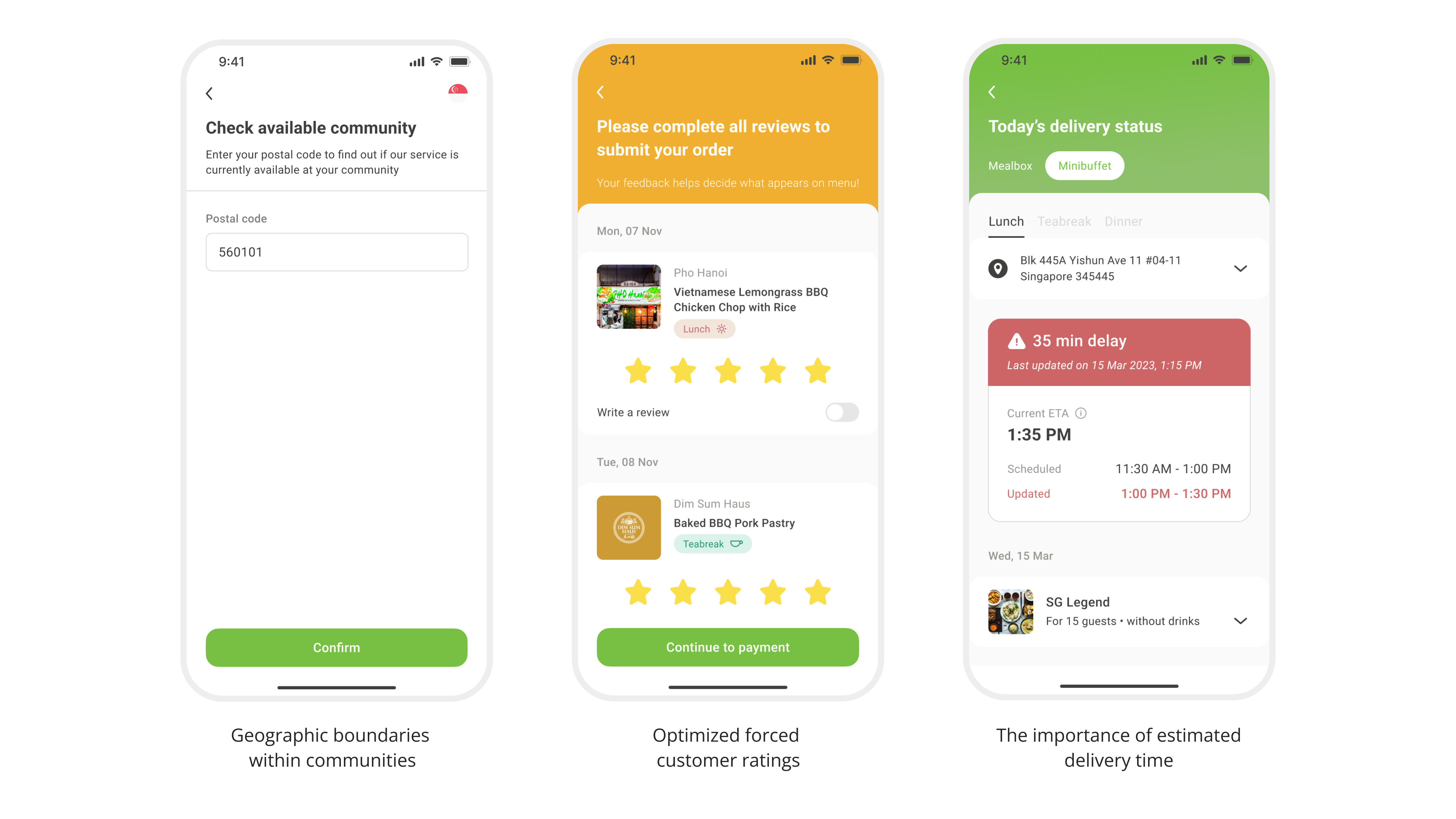
Animation for new users availability within communities to guest account

Key Product Decisions
• No navigation bar
A navigation bar is commonly used in mobile apps to provide users with quick access to different sections or pages within the app. However, it has very little value as an MVP app. Without a navigation bar, the app screen can have a cleaner and less cluttered appearance, which can make it easier for users to focus on the content or task at hand. Moreover, more screen space is available for displaying unique content which can improve the overall user experience.

• Weekly rotation of food choices
A weekly rotation of food options allows for user feedback and input, which can help enhance upcoming menu items and give hawkers more time to improve the quality of their food. This is made possible by the increase in new, delectable hawker food in our database. Additionally, the variety provides a wide range of choices to prevent customers from getting tired of or bored with the same menu items. This design's adaptability and capacity to meet a variety of dietary requirements or preferences, such as vegetarian, gluten-free, or low-carb options for user requests, is another motivator.

•​​​​​​​ Free small sample tasting through Food Entrepreneur Incubation Programme
Free small sample testing is a great way to try a product before deciding to splurge on one. This allows hawkers to receive valuable feedback from potential customers, which can aid in the refinement of their products and increase their chances of success. Consequently, Hawkers will be more confident in launching new dishes with less financial risk. If they ace the food sampling round, Hawkers will be invited to take Livingmenu’s delivery orders from our partnering kitchen on an ad hoc basis.

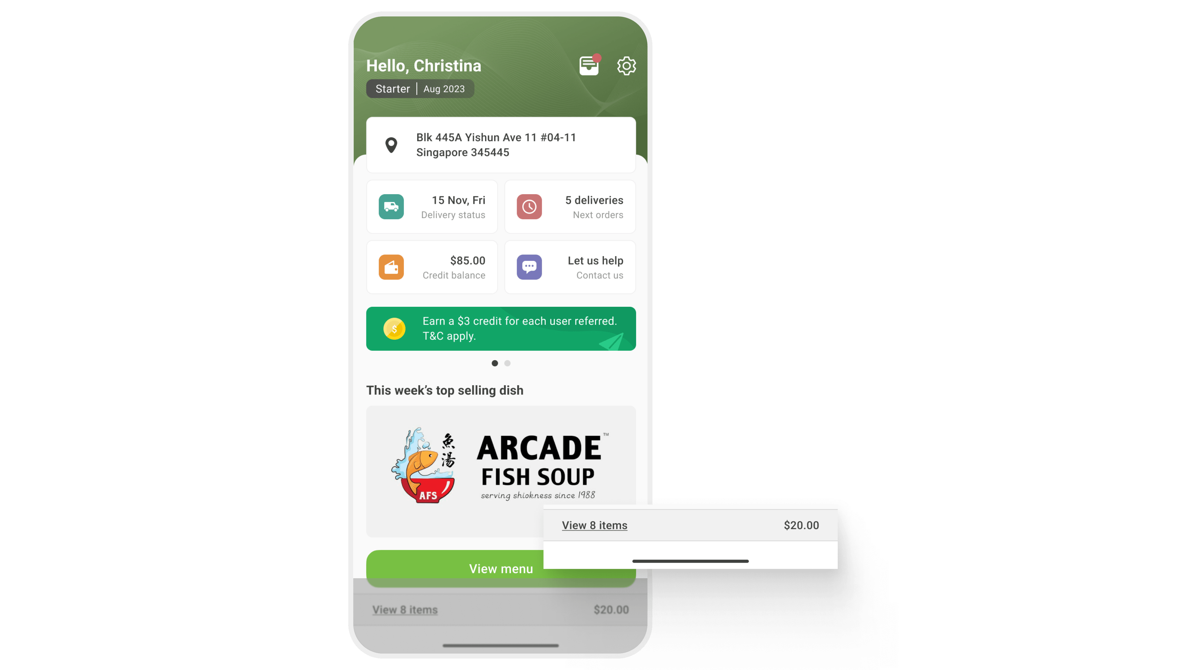
No navigation bar; instead, use spaces to display the cart status bar.

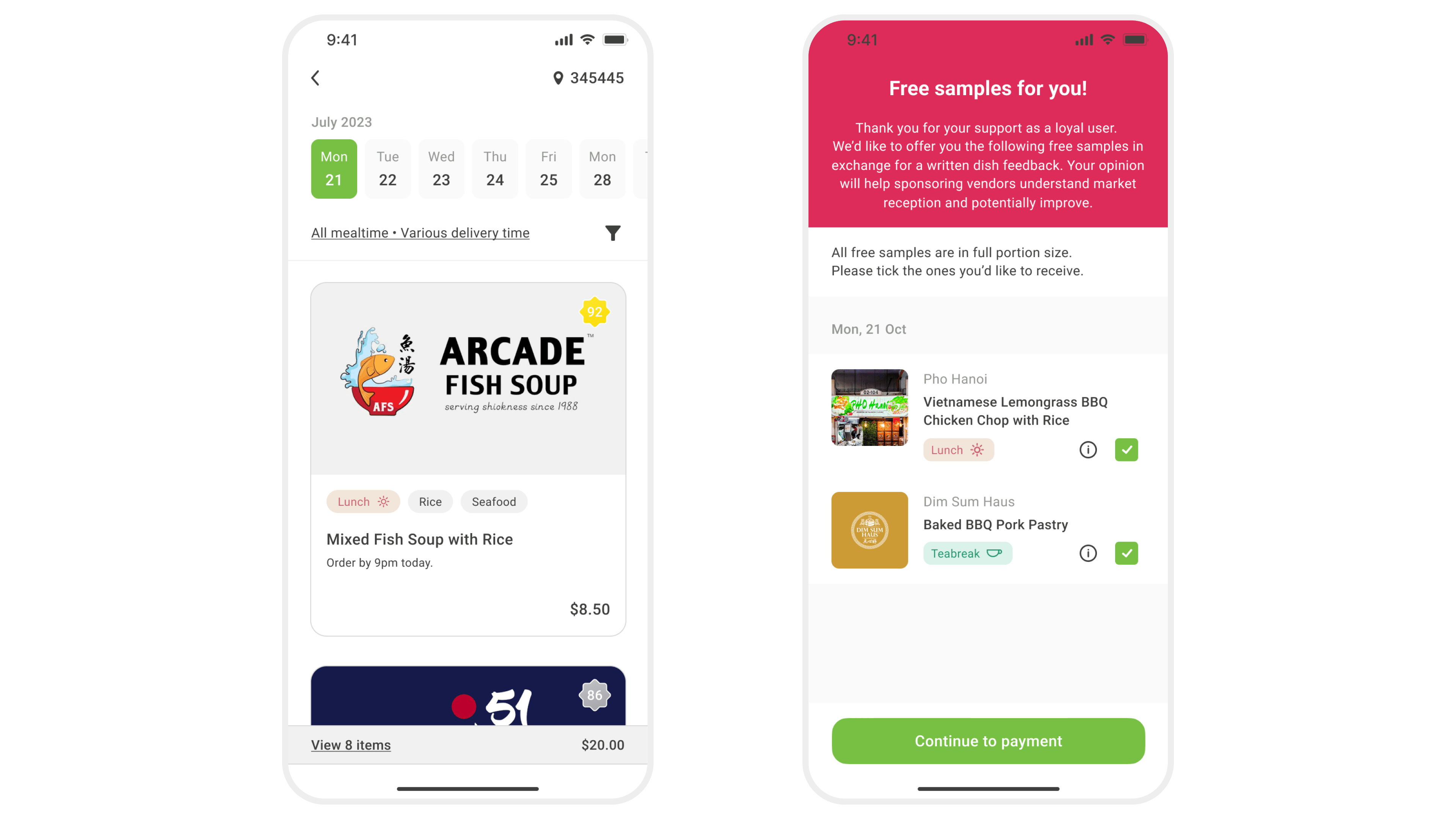
Screens for weekly food rotation and free small sample tasting

Key Designs Decisions 🎯
Here are some key design decisions considered when developing the Livingmenu app.

•​​​​​​​ Use of colour labels for meal time
Colour labels make it simple for users to recognize and pick meals based on mealtime, as shown here with lunch, tea break, and dinner. This reduces any potential drawbacks and ensures that it is user-friendly for all users.

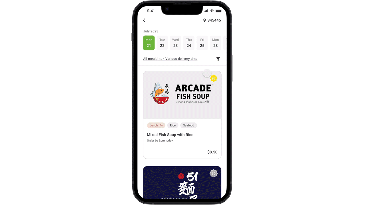
Lunch (red), Teabreak (cool green), Dinner (blue); recognisable universal icons

Key Designs Decisions
•​​​​​​​ Seamline user journey​​​​​​​
With limited features to display on MVP, I used a sequential organization method by directing information step-by-step through content to complete the task customers needed

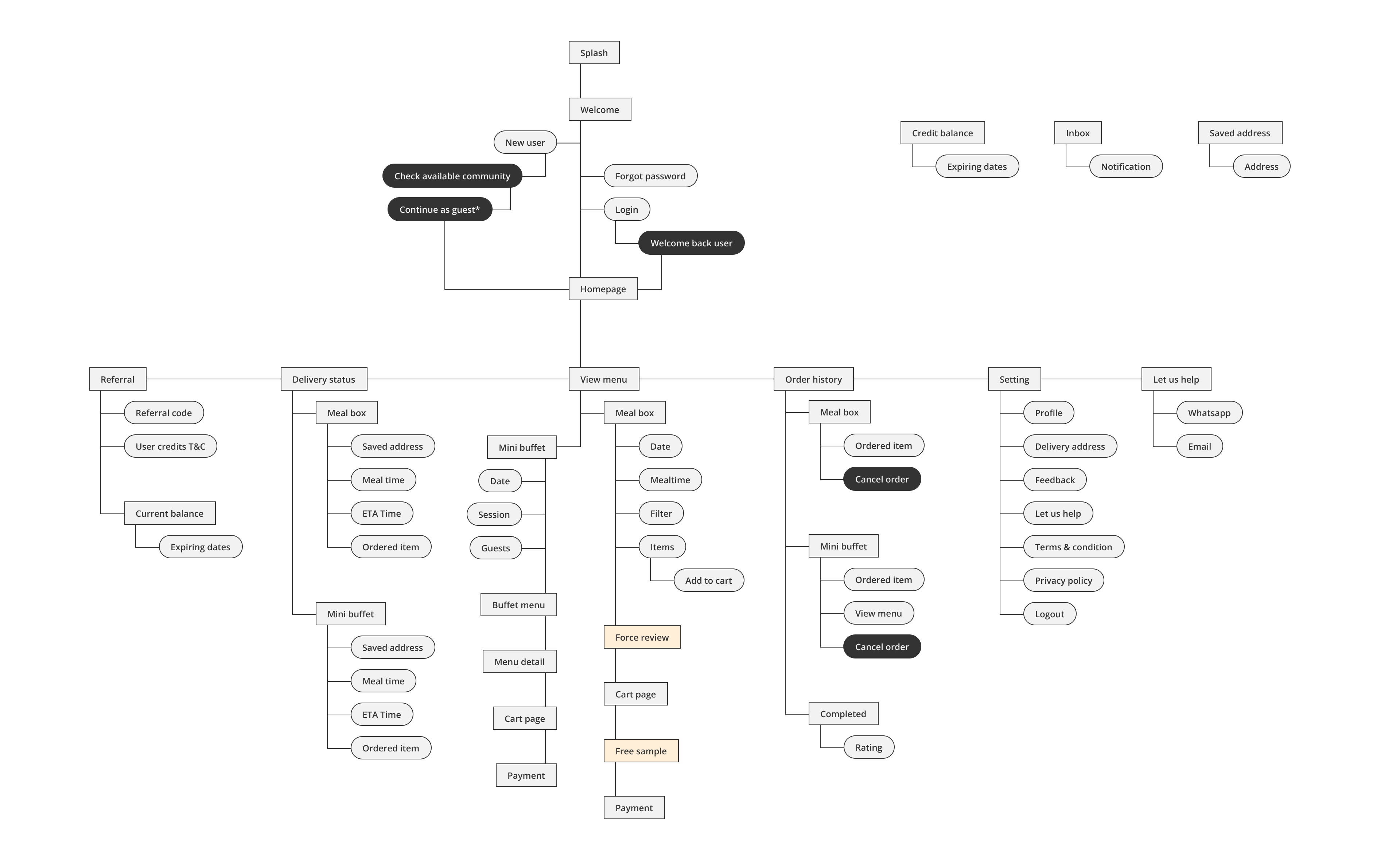
Overview level Information architecture of livingmenu (3.6)

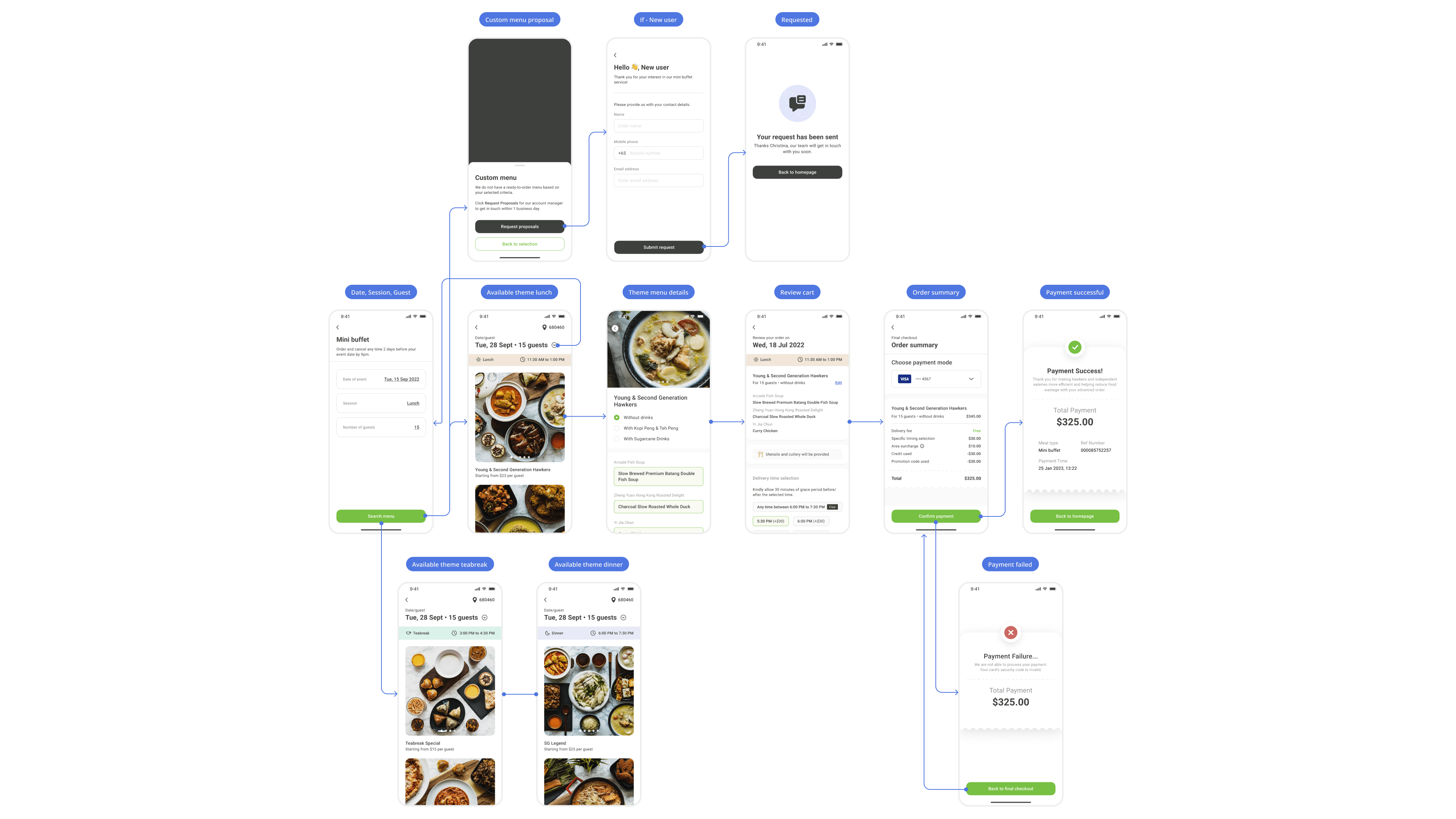
UX flow of mini buffet

User Journey
I conducted interviews with several groups of people using a variety of interview questions to focus on a few customer journeys. Such as meal box and mini buffet.

Using that data, I created this customer journey map to illustrate the high points and challenges of ordering a mini buffet. The user experience during menu browsing is the most frustrating, so finding the best solution became the top priority.

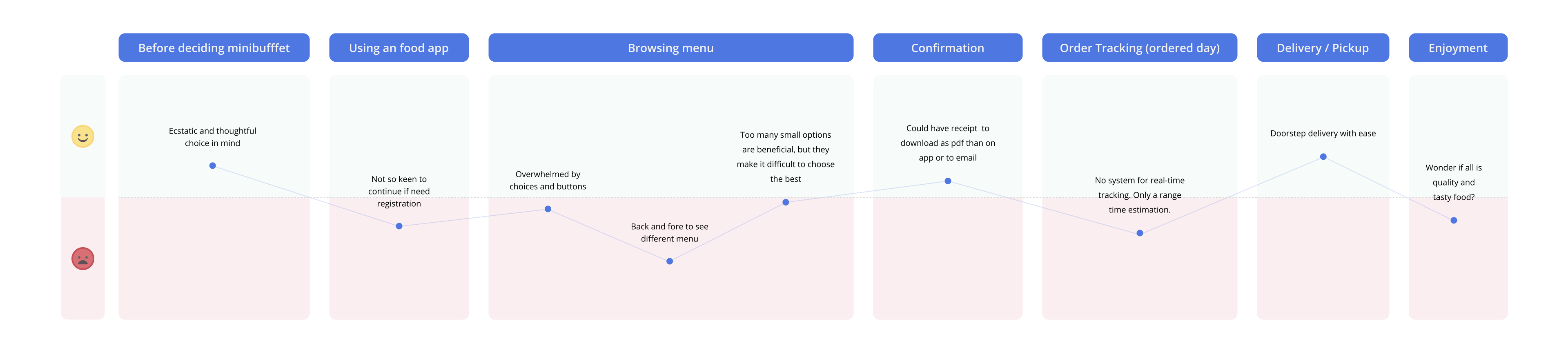
User journey for ordering mini buffet on mobile app

Early Prototype
Learning and new insights developed through mistakes, these were the initial prototypes tested and features improved over time. As of 27 March 2023, the app version was updated from 1.0 to 4.0.

Old prototype screens with no preceding design

Appstore Screenshot - Improve purpose.

Website: living.menu 
Contributed User Experience and Photography