Hawkers' aid from advanced orders leads to more efficient planned communication.
BUSINESS / CASE STUDY / UIUX

Birth of LM Vendor

My Role
Product Designer


About The Team
1 Product Designer, 2 Software Engineers, Ops Manager
Year
Apr 2021 - present


My Contribution
User Research, Prototyping, User Testing, User Interface Design

About LM
Livingmenu is a Singapore-based food tech innovator that empowers greater efficiencies in hawkers, food stalls and independent eateries to improve the sustainability of Asia's local food culture.

Our vision is to create a world where people can eat well affordably, conveniently and make a positive social impact all together. We are building the future food service solution with you, one step at a time.

"Buzzing, Buzzing, Buzzing" 

The Problem
How can we improve vendor operations on all levels, including vendor onboarding, communication, collaboration, and overall operational effectiveness?

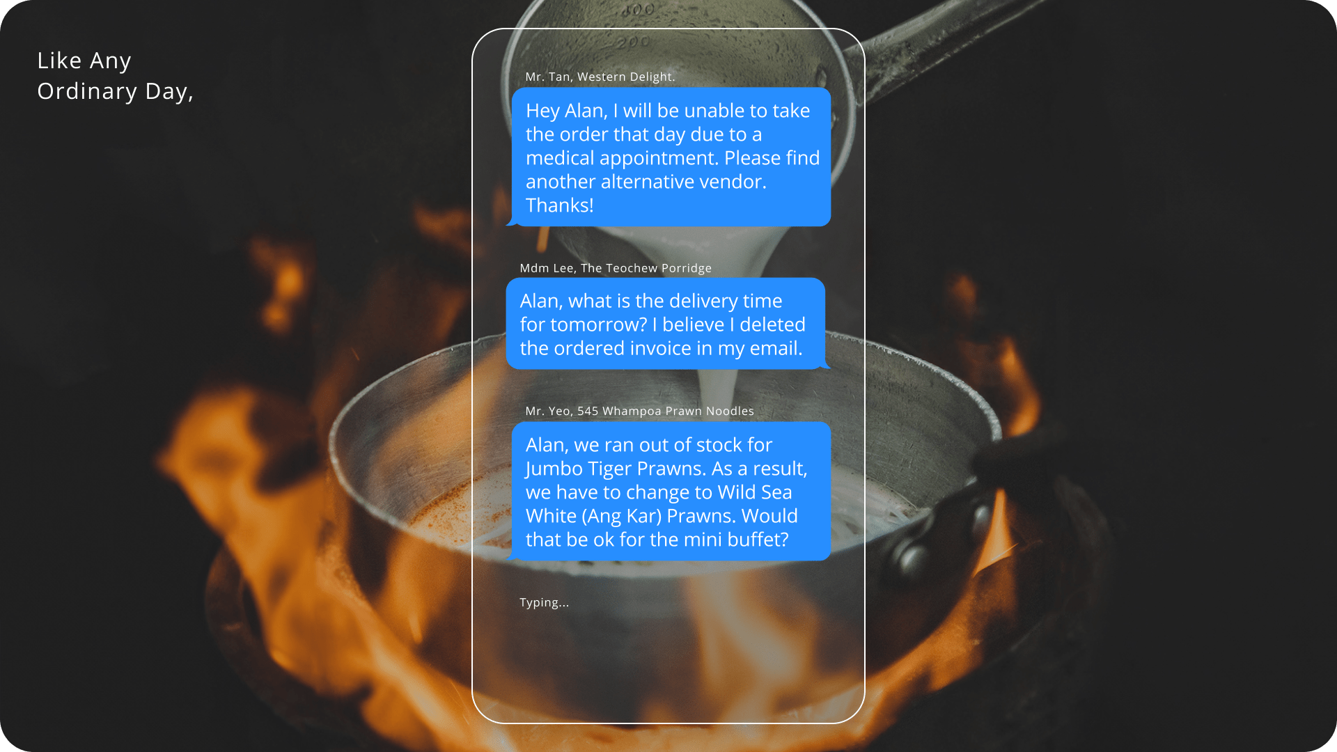
1. Hawker owners are having difficulty getting real-time information due to time communication breakdowns with overloaded updated information, resulting in inaccurate or forgotten orders, while wanting to focus on cooking better quality dishes.

2. Alan, livingmenu operation manager and father of two, needs to rapidly resolve a variety of minor difficulties with hawker owners that do not require assistance in order to spend more time with family and things that truly matter.

Groundwork
Within a year of the app's launch, nearly 300 hawkers owners had joined the partnership. Every day, 24 hours a day, innumerable SMSes would be sent to the Ops manager regarding overdue payments, invoicing, and coordination between pre-ordered menus and delivery. It was a challenging task to keep track of everything and respond quickly, which resulted in poor communication performance and growth. 

A basic dashboard was created to organize and amend ordered information, however it can only be viewed by the Ops manager and ordered information is only sent to hawkers by email. Changes will be made via Whatsapp, and amendments need to be made by repeating the process.

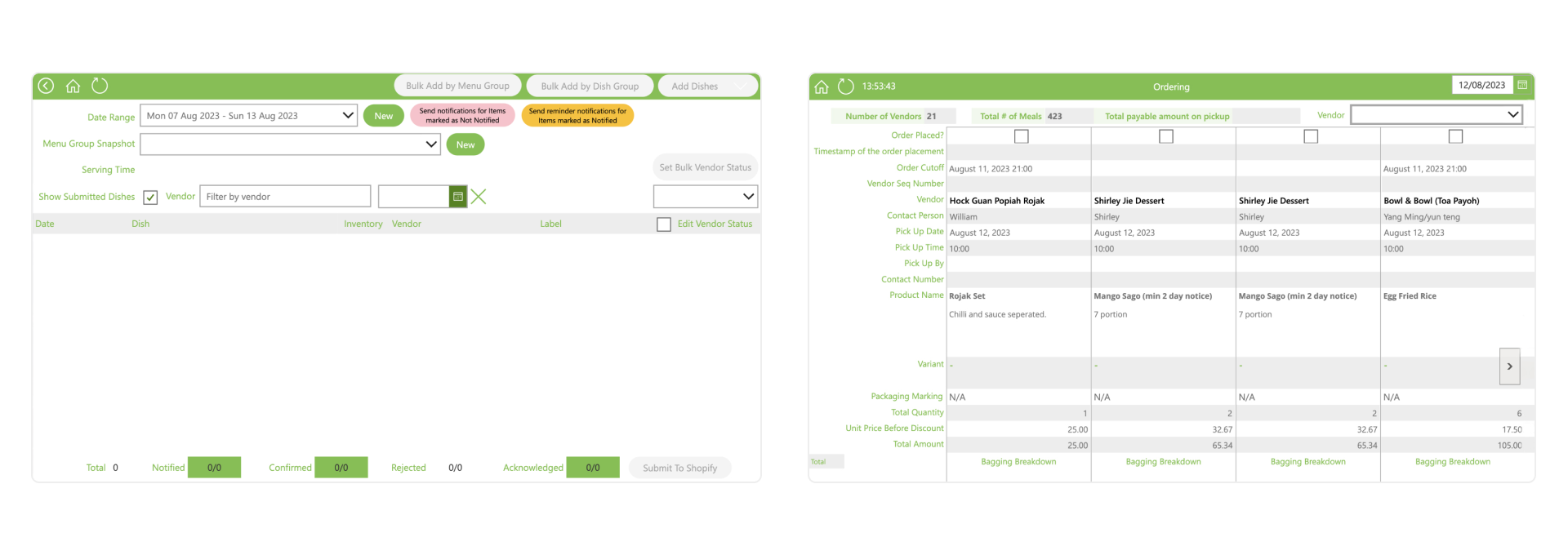
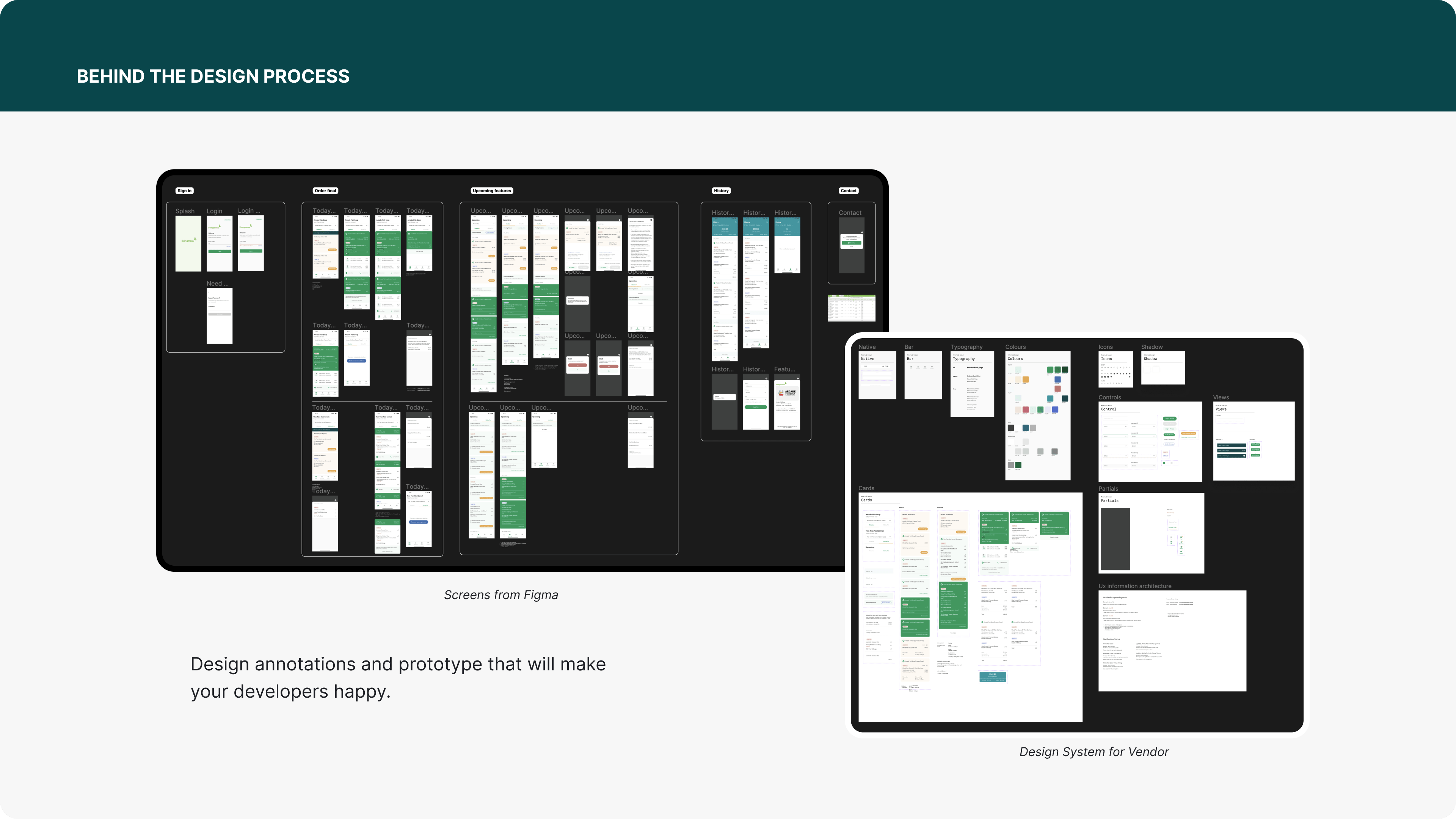
Power app screenshot
Left - Create and Submit Weekly menu to Shopify
Right - View Daily Vendor Orders and mark them as paid

The Solution
On April 2021, we launched LM Vendor (MVP) designed to cater to the needs of hawker owners first and reduce workload for Ops manager. It offers a streamlined solution, empowering hawker owners to access essential information effortlessly.

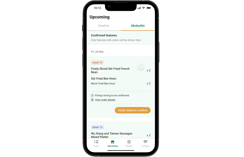
Through LM Vendor, hawker owners can conveniently view real-time ordered information, monitor delivery times, review order history, and access invoices, all without the hassle of searching through scattered emails. These are the app's 3 most significant features. 2 major modifications were released to address assumptions and misconceptions.

For older hawkers who are unable to understand English, a Chinese version was made available.
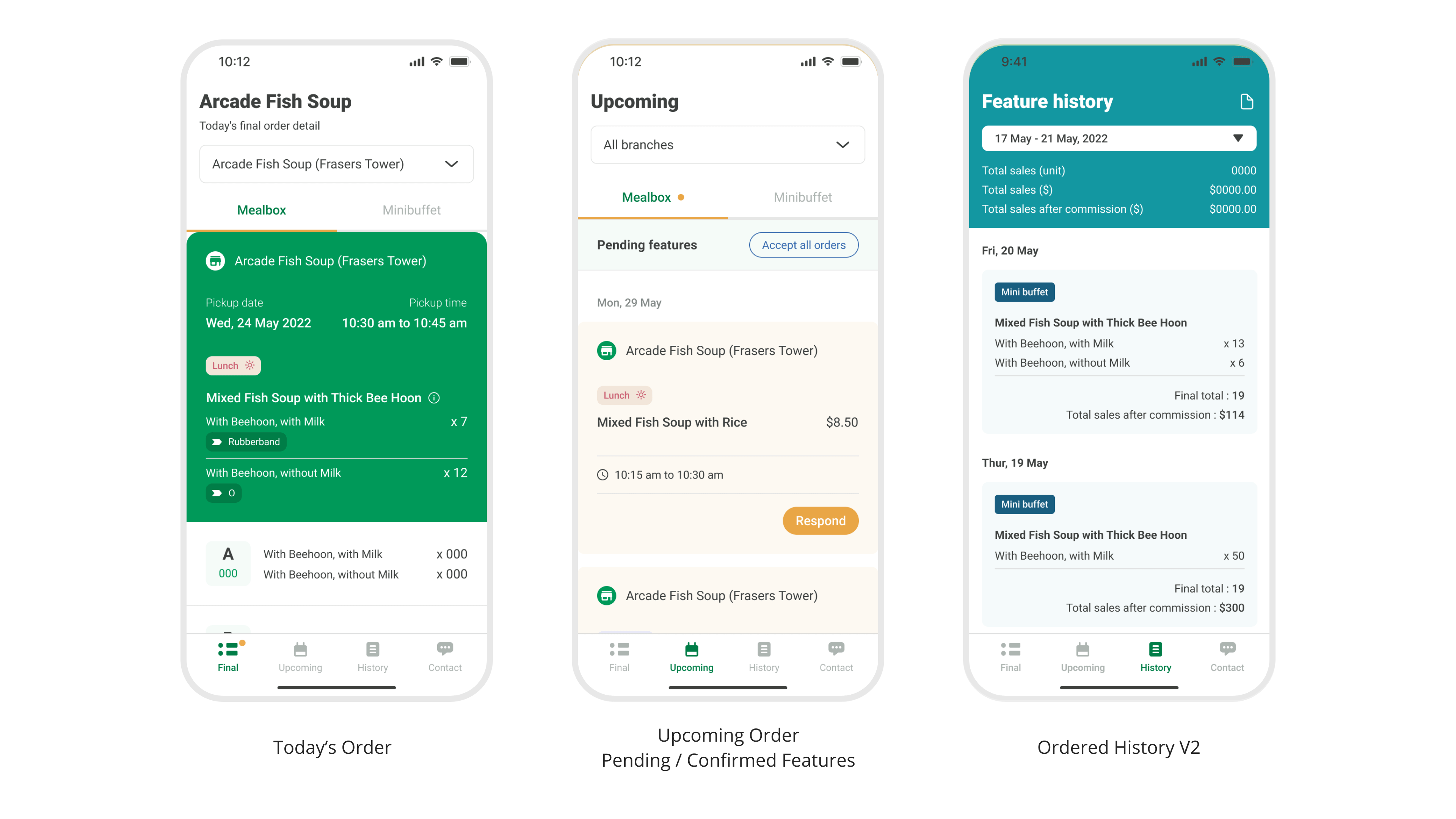
MVP features

The Solution
On Nov 2022, with iterative feedback and improvement, a better user journey, new minibuffet features, and UI were implemented. LM Vendor transforms the way hawker owners take orders with their businesses, ultimately leading to improved productivity.

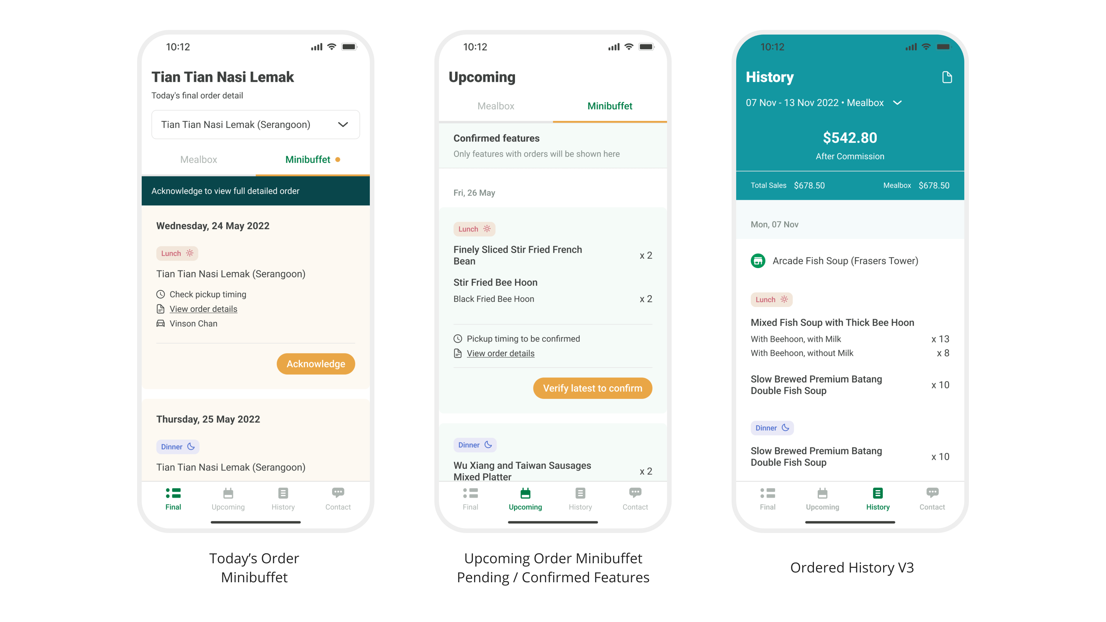
With Minibuffet Features and Overall Improvements

Response
As of July 2023, we achieved

Hawker owners' satisfaction> 92%
Meals served to highly satisfied customers > 330k
Punctuality record > 99%

Jiayou Hawkers For People Who Loves To Eat

Feature Effectiveness
Some features demand extended development timelines while others promise a more significant return on investment on MVP.

The primary objective of LM Vendor UI is clarity and UX should be simple. I place them on a MoSCoW analysis to learn an overview and focus on the most important features.

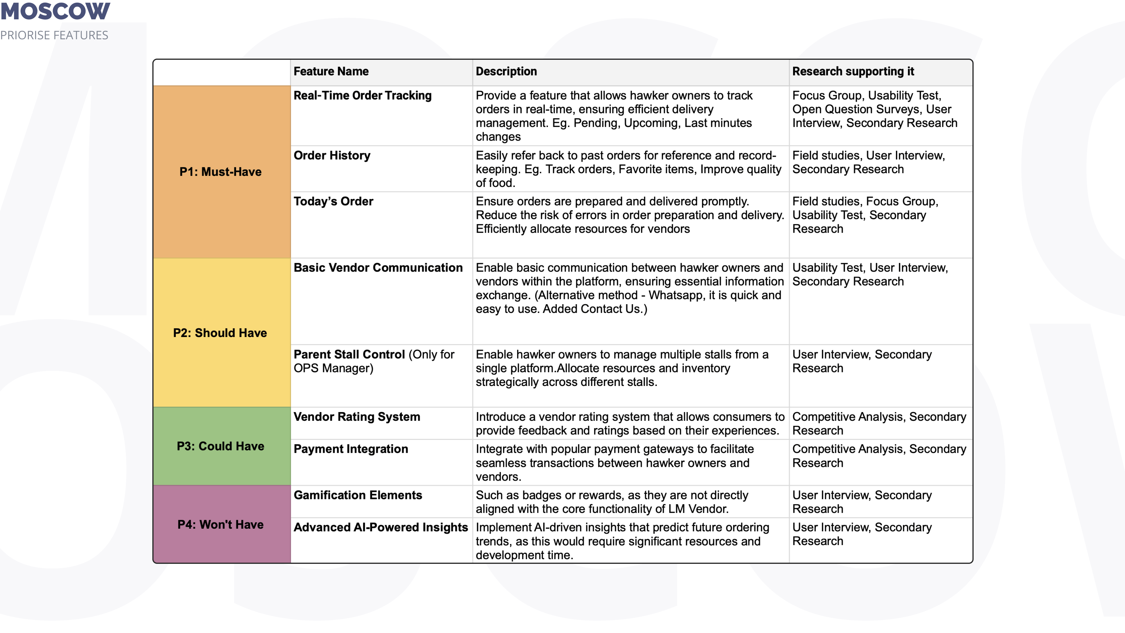
Prioritize what’s important and what’s not.

Pointers were taken from key findings and mapped here.

Key Product Decisions 🎯
Below are crucial aspects of product decisions that require careful consideration and analysis of various factors such as understanding simple information. It establishes a sense of predictability and comfort, allowing hawker owners to focus on achieving their tasks rather than deciphering new design elements. 

• Navigation Bars with 4 simple destinations
Provide quick access to different sections, enhancing usability and reducing friction So that hawker owners require easy and efficient navigation to key information without confusion or frustration. This improved user satisfaction and confidence.


• Final Acknowledgment Order
A final acknowledgment step before order confirmation gives hawker owners one last chance to check, fix, and decrease errors. Serves as a reminder because many orders are confirmed in advance. It makes hawker owners appreciate this additional verification process, which results from more correct orders and higher revenues.

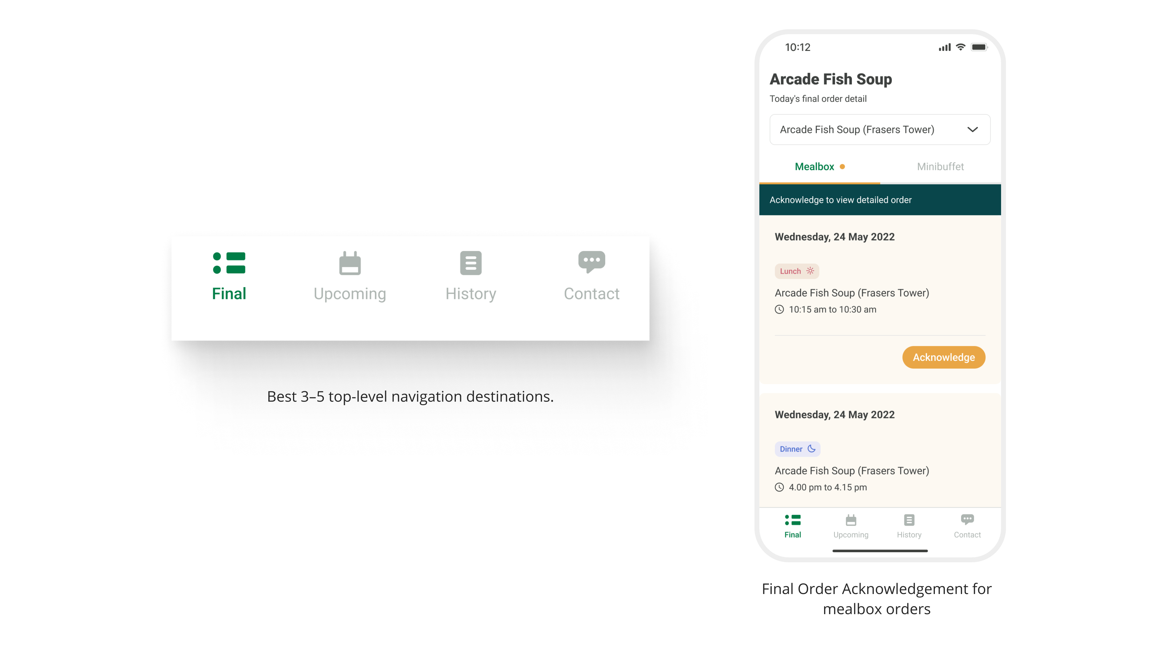
a) System of orientation 
b) Closer human-made interaction

Key Product Decisions
• Respond Button to Record Vendor as Seen
Recognise successful vendor interactions and confirm the accuracy of their received scheduled or updated ordered information to backend. It improved transparency and vendor accountability.

Vendor's presence

Key Product
• Card Design for Different Stages
Utilizing distinct card designs for different stages of the user journey enhances visual cues and assists hawker owners understand orders during the process, especially for the upcoming order section where I created 3 easy colour values for identification. Helper text has been included to assist colourblind users. 

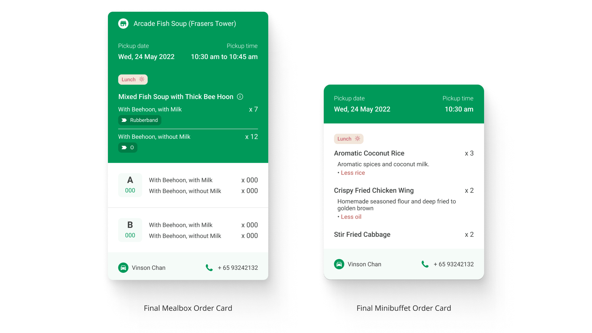
Various card designs
e.g Final Card - Mealbox vs Minibuffet

Key Designs Decisions 🎯
Here are some key design decisions considered when developing the LM Vendor. 

• Colour Code for Meal Type Differentiation
Implementing a color code to differentiate between lunch and dinner menu enhances user comprehension and simplifies the selection process. Hawker owners recognize the ordered menu quickly reducing confusion and potential ordering errors.


• 3 Standard Colour Variables to Indicate Stages
Utilizing colour variables for different stages enhances visual consistency and user understanding. Light Orange card is used to alert users of important decisions to be made. A light Teal card is used to indicate a pause during an intermediate process. A teal green card marks the final stage of an approved agreement. This simple design enhanced clarity and user engagement. Hawker owners can easily recognize menu ordered stages and overall progress, leading to a more intuitive and satisfying user experience.

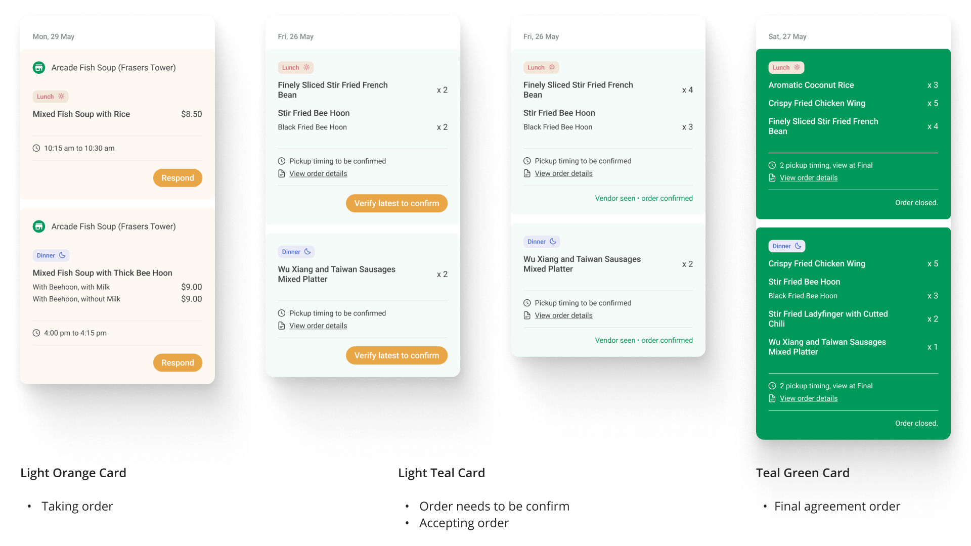
3 easy identification

Key Designs Decisions
• Clear 1-Click CTA Button
Prominent actions that guide them towards their intended agenda. A clear CTA button reduces confusion and the steps needed to complete a task and greatly limits Hawker owners' decision-making. Task completion leads to more upcoming orders and time for Hawker owners to experiment with their new food dishes.

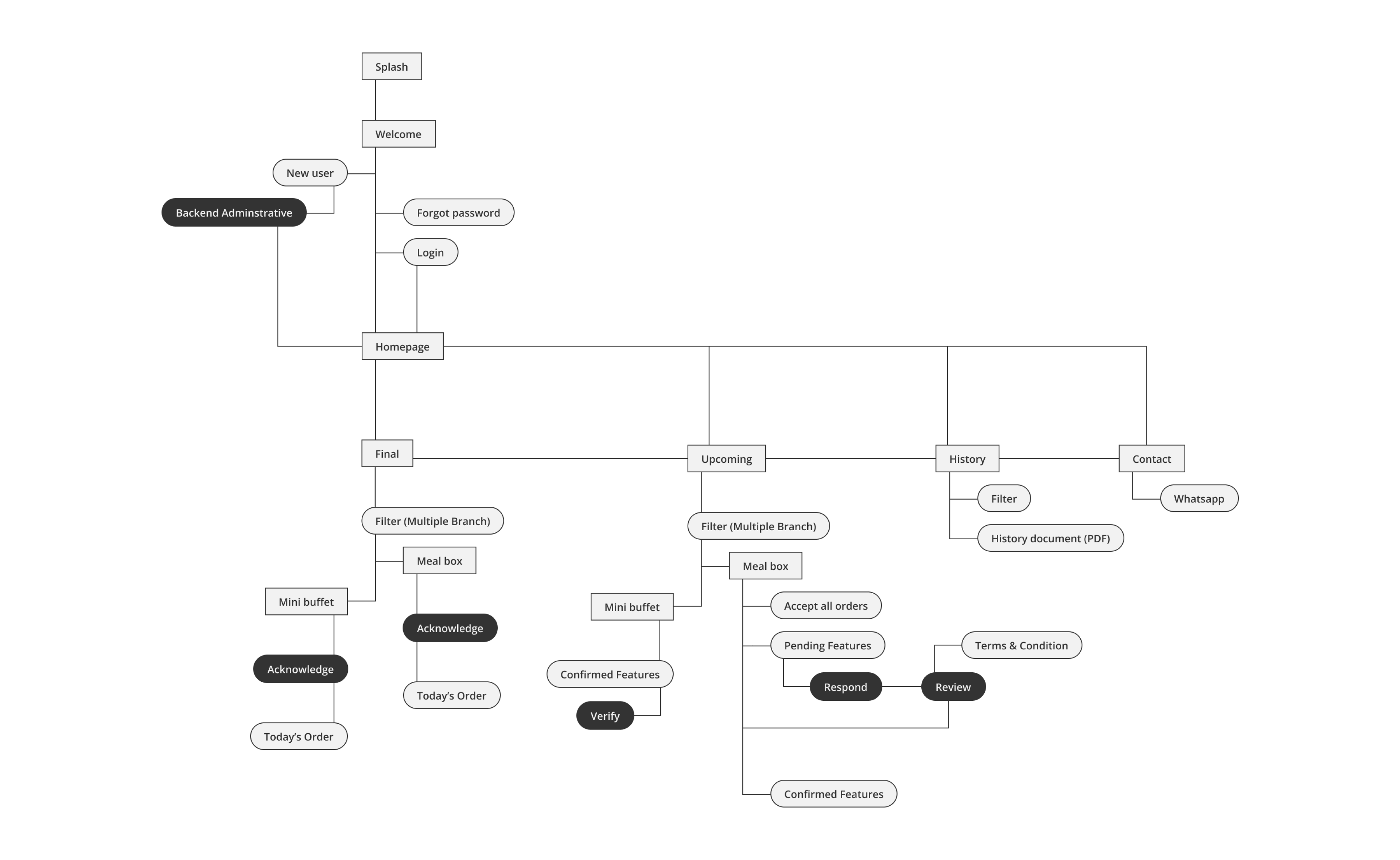
Information architecture level of LM Vendor

User Journey
My research started with field investigations that visit 20 permanent partnership hawker owners, I asked them a variety of interview questions about the dos and don'ts of their experiences, notably with meal boxes and mini buffets ordering process.

Following the first MVP app - Vendor App Feedback Form

Using that data, I produced this Empathy Mapping to highlight the benefits and drawbacks of using vendor app for taking orders. As a result, our focus shifted to figuring out a simple and quick navigation.

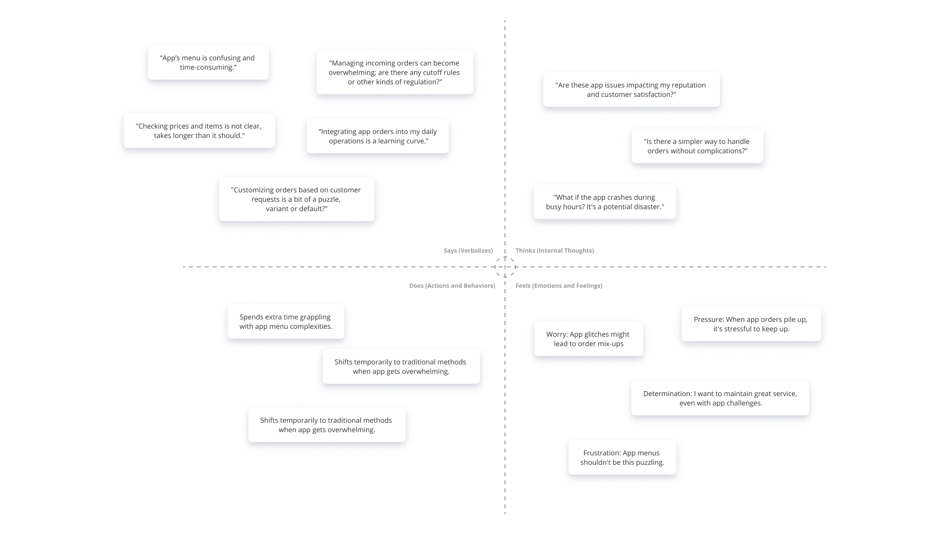
Understand Hawker owner's empathy mapping - the difficulties and frustrations

Early Prototype
Learnings and new insights developed through mistakes, these were the initial prototypes tested and features improved over time. As of July 2023, the app version was updated from 1.0 to 1.3

View Prototype ⇢

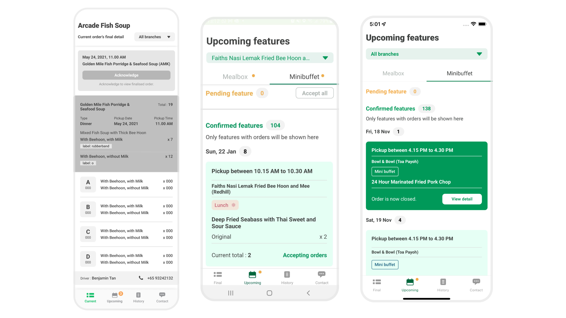
Old prototype screens with no preceding design

Left - Very first grayscale design layout to structure important information
Middle - Implement Minibuffet with the needed info
Right - Information layout for testing

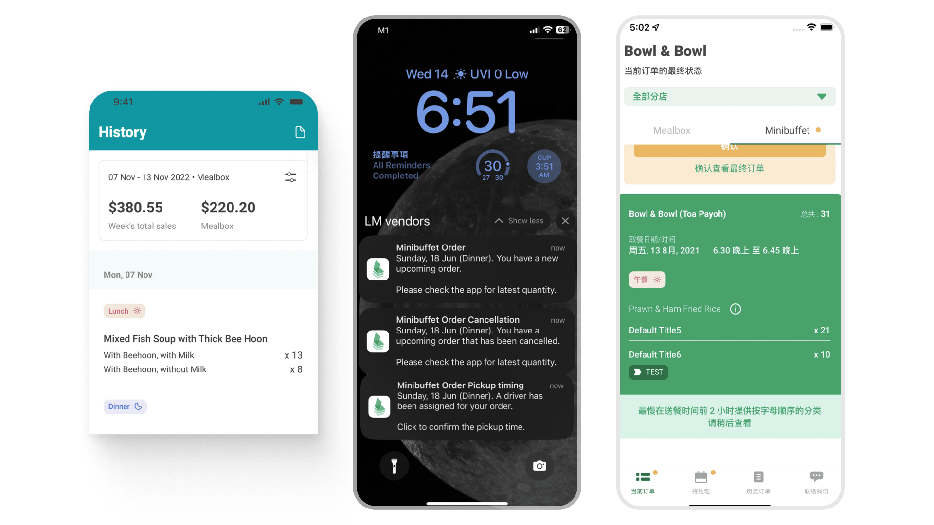
Left - History's design V1.5
Middle - Various notification standards to understand the order
Right - Chinese version for older generation